Update
It has been a few weeks since I have updated this blog. To fill you in, my life has been crazy hectic! I recently moved to the sunny state of Arizona, and got a job as a Foreclosure Specialist at Nationstar. I have also found a great place to live and have been making new friends here in the valley. Arizona has turned out to be a real gem of a state. Such natural beauty, I can hardly wait to explore more of it once it cools down.Monsoons and Weather
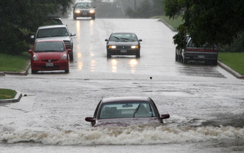
Naturally, coming from a weather background, I cannot help but notice all the weather that has been going on in the area. From torrential downpours, too extreme lightning, Arizona appears to be rich with weather activity. It is monsoon season! Scientifically speaking, monsoons are classified as a change in the predominant wind direction. There are two types of monsoons: dry and wet. Arizona usually experiences a wet monsoon. As you can see from the pictures that I posted, monsoons can have a big impact on the environment and us.

So what forces contribute to wind flow changes in Arizona?
How does the National Weather Service recognize when monsoon season has started?
Lets take a look!
Forces Contributing to Monsoon Season
In order to understand wind flows, you first have to understand thermodynamic principles. The laws of thermodynamics states that energy must flow from areas of high pressure to areas of low pressure. In meteorology, we are all about temperatures, dew points, densities, pressure, ect. So when we talk about pressure, we are really saying that areas of high pressure can be assumed to have cooler temperatures, and areas of low pressure can be assumed to have warmer temperatures. That is why in the summertime, it is always cooler on the floor of your home, and it is always hot towards the ceiling (hot air rises, cool air sinks. Think of the air as density).
On a broader scale (scale, another important meteorology concept), Arizona begins to experience increasingly hot temperatures leading into the summer months. Factoring in what we learned earlier (hot air rises), a thermal low pressure system begins to develop over the Arizona region. This low pressure system is the beginning phase of the wind shift. As the low pressure system develops, the subtropical high pressure ridge pushes into the central United States. When this happens, we begin to see a change in wind flow. Instead of winds coming from the west north west, we begin to get a warm and moist southerly flow of air. Humidity (dew points rise) in the desert region increases significantly, and thus storms are able to develop.

How to recognize monsoons and the National Weather Service's definition for monsoons
Recognizing the beginning of monsoon season is not rocket science. I'm sure all of us in Arizona are used to the 101 flooding or cars washing away.

Diving into a more scientific approach, the NWS has stated that it classifies the beginning of monsoon season when dew point temperatures are above 50 degrees fahrenheit for more than 3 days. This illustrates that a direction change in the predominant wind has had a chance to impact the region.
So lets take a look at current weather conditions (obviously we are in monsoon season, this is just to hammer home my point). This picture shows temperature and dew points (temperature being on top and dew point being on bottom).

As we can see, dew point temperatures are at 61 degrees. So we are still in monsoon season.
Just to further illustrate how well this works, the below picture is of a graph showing dew point temperatures and rainfall patterns in the Phoenix area.
Dew Point Temperatures:

Rainfall/Thunderstorm records:

Comparing the two graphs reveal that the higher percentages of rain and thunderstorms occur when the dew point temperatures are above 50 degrees.
To wrap things up, I hope you all enjoyed my insight into what monsoons are, the forces that drive them, and some defining meteorological characteristics. While everyone says forecasting for a desert is easy, it can still pose interesting weather situations. Thanks for reading!
Sources
http://www.spc.noaa.gov/exper/mesoanalysis/new/viewsector.php?sector=12#
http://weatherspark.com/averages/30108/Phoenix-Arizona-United-States


